The client
The Forge is a SaaS “virtual table-top” online role-playing hosting platform serving a large community of gamers all around the world.
Challenge
The Forge is a platform that has a number of virtues, besides having the “first mover” advantage—unique “quality of life” features for players and game masters, top-tier web infrastructure performance, an integrated marketplace, at prices that consistently beat each and every competitor. These qualities needed to be highlighted with a brand that would answer to a credible and sustainable promise over time, capable of boosting sales and keeping the competition at bay, convincing website visitors that they were dealing with something entirely different from a mere “VTT hosting service” and creating an emotional connection to the brand.
The Forge originally had what we would call a MVB: a “minimum viable brand”, with only the bare necessities needed to bootstrap the nascent company: a working service, a website focused on functionality rather than persuasive sales copy and stylish design, a small community of enthusiastic early-adopters, little to no artwork and brand assets, and a permissively-licensed piece of game artwork as a temporary logo.
However, as its quality of service, feature set and customer base grew, it needed unique branding that could change its international community’s perception from being an early-stage hosting service offering to being perceived as a professional, trustworthy and incomparably convenient all-integrated solution for role-playing game masters seeking more than regular hosting infrastructure.
The Forge was making significant investments across its service offering, including significant infrastructure and UX upgrades, and crushing the competition on features and price. But they weren’t getting credit from prospective customers for all that they were doing. After a year of operating under the same “temporary” logo and website, the Forge was ready for a brand identity it could truly own, and a website that could truly sell.
Pictured below: the old Forge website & logo

Solution
We devised “Fight Goblins, Not Servers” as the Forge’s brand idea. This slogan and positioning allowed the Forge to convey its core offering in an intuitive and memorable way to its community of advocates, and the prospects encountering the brand.
A new brand identity was created around this concept and the Forge’s temporary—yet iconic, so to speak—logo, to transition its shared visual identity to one uniquely its own without too much brand disruption, and to truly realize the Forge’s memorable promise.
Along with the new logo developed in many formfactors (check out the Forge’s blog further below for a more detailed writeup on the logo’s design process), brand touchpoints (such as the website’s contents and appearance) were redesigned to transmit the “epic” yet “playful” energy of the Forge along with a homage to its cultural roots in traditional role-playing and storytelling games, through use of detailed, expressive and colourful brand elements and symbols that define the emotions and first impressions for individuals encountering the Forge for the first time.
Results
We designed the new logo icon, in multiple variants, entirely as vector graphics, using the SVG format and open source software design tools. No raster graphics software was used for rendering the effects seen on the icon. As a result, the Forge has a brand asset that can be adapted and scaled to their varied usecases for years to come.
The updated look & feel honors the Forge’s previously appreciated “MVB” elements while capturing the professional and “quality first” ethos of the Forge.
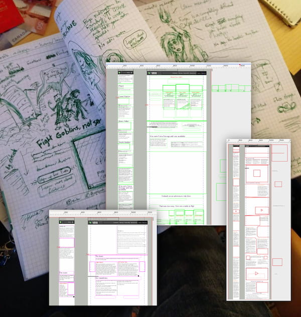
The basic conceptual sketches and layout wireframes we designed provided a baseline for the Forge’s team to build a new website design, and as a general starting point for the Forge’s illustrators to turn them into beautiful vivid artwork to reinforce the Forge’s high-end feel.
The copywriting service we provided to help kickstart some of the new page contents allowed the Forge to more clearly communicate its unique features to potential customers.
You may be interested in…
“Projet collectif”
Sometimes, it's not about a logo, and all about the naming. Check out this case study about a NGO needing to decide on the names of three of its core brand assets so that it could raise investment and grow its community.
ETS university
We have fulfilled various design and event management projects for several departments of ETS, a top-tier applied engineering university in Canada.
GNOME Foundation
For many years, we have designed and produced the GNOME Foundation's annual reports, using open-source software exclusively.